Designing a cockpit that stays calm
Once the front door is a ledger and every claim is sourced, the interface has a hard job: show a genuinely capable system without turning into a wall of panels and numbers. A cockpit, not a dashboard.
Two decisions shaped it.
The first is material. Penchant uses a warm palette we call Hearth — parchment-toned light surfaces, and a dark mode that reads as a dim room rather than the usual cold blue-black. That is not decoration. Software that runs your admin and stops you at the consequential moments is going to be lived in for hours; it should feel like a calm room you can think in, not a control panel demanding attention. Warm neutrals and a single ember accent do more for that than another chart would.
The second is that the workspace has a small number of postures rather than an endless spread of screens. You are either having a conversation to shape work, operating on prepared work, building something, or studying sources. The interface leans into whichever posture you are in and gets out of the way for the rest, so the surface area you actually face at any moment stays small even though the system underneath is not.
Running through all of it is the same rule from the memory work: the source is always one gesture away. A claim, a note, a piece of retained knowledge — you can open the exact passage behind it without leaving what you were doing.
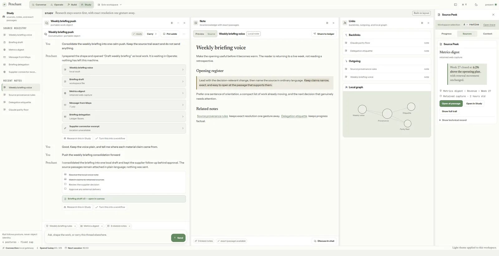
The image above is a design study, not a shipped screen — the content in it is placeholder, and we are showing the shape of the thing rather than claiming it runs today. Getting this to feel calm took several rounds and a fair number of dead ends, some of which will get their own entries. The next one is the decision that all of this is built around: what happens when the work is about to leave your machine.